ShopDreamUp AI ArtDreamUp

Deviation Actions


Suggested Deviants


Suggested Collections


You Might Like…


Comments21
Join the community to add your comment. Already a deviant? Log In
You are an AMAZINGGGG artist, so I'm just gunna focus on things i think could improve:
First, I feel that the creature's pointer finger is oddly sitting on top of its body and doesn't have enough depth/definition.
I feel that this piece is not as saturated as it could be. For a more dramatic effect or "Impact" with this picture, I'd darken the darks a little more. Otherwise, the viewer will glaze over parts of the picture (like the bottom) since its not arresting their eyes. Its crotch and leg is mostly what I mean. The head of the creature, however, takes the most attention when viewing since it is 1) centered and 2) more detailed in its aesthetics. The head has more shading, more highlights, and is overall more dynamic. As a result, the head seems detached from its body.
This is a doodle, so I know you probably didn't do your full effects and things<img src="e.deviantart.net/emoticons/s/s…" width="15" height="15" alt="
The largest thing that I thing I can critique this piece on is its motif/central theme. I feel that your other creatures have a more solid shape and motif that is memorable even as a silhouette.
In contrast, I feel that this creature is not as centralized in its idea in comparison to the others and is just a tad bit weaker. The others have simple ideas with complex design that stay better with the viewer:
i.e. Snowcap= path turned monster, Nuclear Planet eater= bulbous shape, etc.
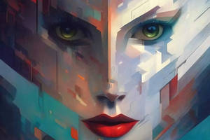
Its hard to say alot because its only a headshot, but you hinted to its overall shape. I recommend mostly that you continue those yellow bump things a little more around his body to really make this creature unique(cuz those things are really cool!) . I'd also recommend defining the texture of the white things on his head to better bring this creature to life in one's mind.
Its overall a strong picture in which i feel the execution beats the concept.
These are just my opinions as a viewer rather than a senior in skill. I absolutely LOVE your art. Keep it up!!! <img src="e.deviantart.net/emoticons/b/b…" width="15" height="15" alt="